Pantheon's First Time User Experience
Pantheon is a website management platform for Drupal and WordPress that provides developers, universities, and agencies with container based hosting and powerful developer tools. Developers who standardize their workflow around Pantheon love the product for its powerful development tools which make it easier to build, manage, and launch sites.
The challenge
Pantheon was built without a first time user onboarding experience to teach users how to start developing with the product. Despite this, there is a healthy user base who love the product. We dove into the metrics to better understand what brings users back to the platform and found after a user pushes code within the first 48 hours, they are much more likely to be active on the platform. Active developers are more likely to purchase a site and convert to a paying Pantheon user. Using design research and analytics, the product & design team hypothesized that if Pantheon could guide its users to push code within the first 48 hours of creating a new account, it could increase user activation and retention.
Pantheon's product is like IKEA furniture: functional, utilitarian, and effective. However using the product for the first time is like receiving your IKEA furniture without any instructions for assembly.
Early screens showing Pantheon's "First Time User Experience"
These original screens don't give a user much context what the value of Pantheon is and what they would need to do in the product to get value out of it. They provide little guidance on how to start using the product effectively.
My role
As a product designer on the project, my responsibilities included:
- collaborating with another product designer to create several approaches to onboarding experiences and conducting usability tests
- prototyping onboarding experiences for testing
- working with product managers to determine the project's business value and how to prioritize/plan work accordingly
- pairing with engineers to convert interface work into patterns for the front end design system
- and designing the user interface/product experience the engineers would implement
Research and discovery
In order to understand our first time users experience we recruited users who have never touched Pantheon before to observe them using the product and attempting to launch a site and push code. We analyzed the issues they had working on the platform and categorized usability issues into themes that would go on to inform how we want to think about designing features for Pantheon:
-
Surface next steps and tasks for the user
Users generally had no idea what to do next on the platform. -
Leverage mental models to learn Pantheon
Developers have some common practices developing sites – Pantheon's product should consider this and emulate it whenever possible. -
Provide reassurance through the interface
When a user initiates an action, the interface should reflect the status and tell the user if there's any other actions they need to consider, such as better error handling and messaging.
Users had trouble following the steps to install a CMS and pushing code...
Pantheon is a powerful tool, but the site dashboard has 31 different buttons and actions a user can take – how do they know which is the first step to developing their site?
Based on this research we created several prototypes with particular techniques or approaches to guide the user through the onboarding experience. We further tested the prototypes and analyzed the positives and negatives of each approach, so that we could combine our learnings into the best version of an onboarding experience we could do.
The Solution
The new onboarding experience was split into three major areas – each addressing a large hurdle for new users. One advantage of breaking the experience apart allowed for parallel development from multiple teams and reducing delivery dependencies.
1. Welcome screens guide new users
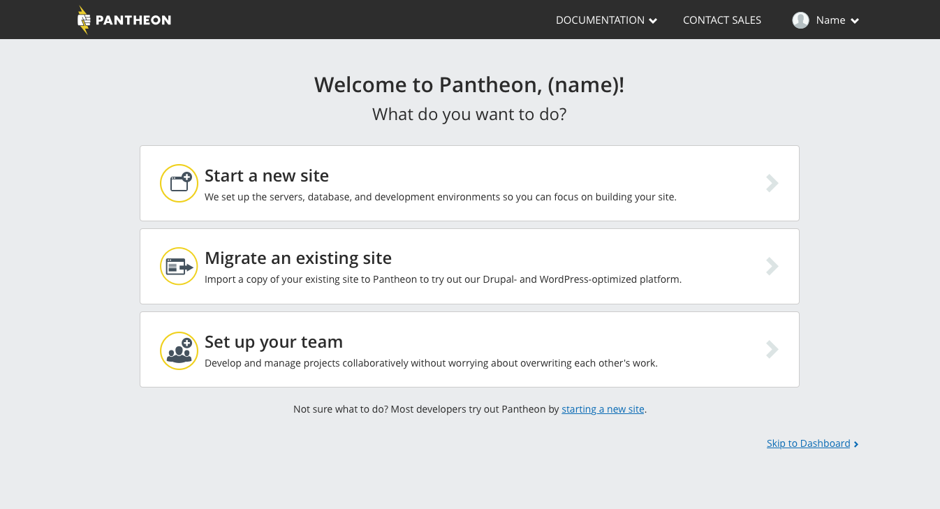
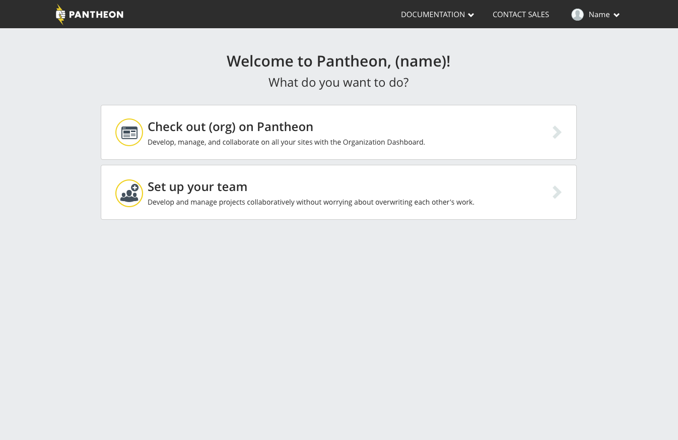
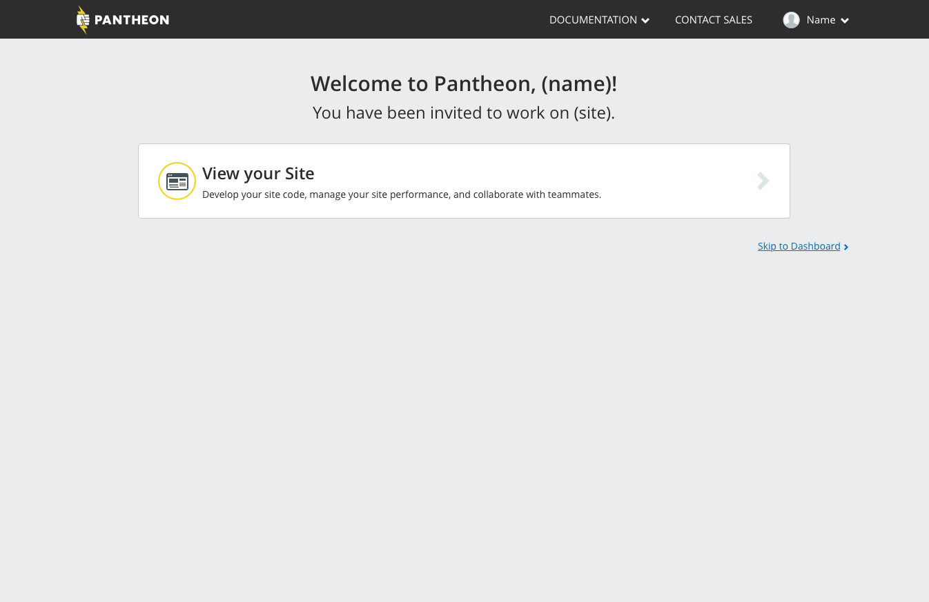
New screens were created to guide first time users on how they could start using Pantheon. The product has four distinct paths for users to sign up and start using the product, so we designed welcome screens for each of these paths. Each welcome screen should guide users to actions that are relevant to how they first signed up and how they would get the most value out of Pantheon, with the eventual goal of teaching them to use the platform and developing a site on Pantheon.
We created welcome screens with better product guidance for new users ...
...or agency organizations to manage their workspace
... or users who just purchased a Pantheon site.
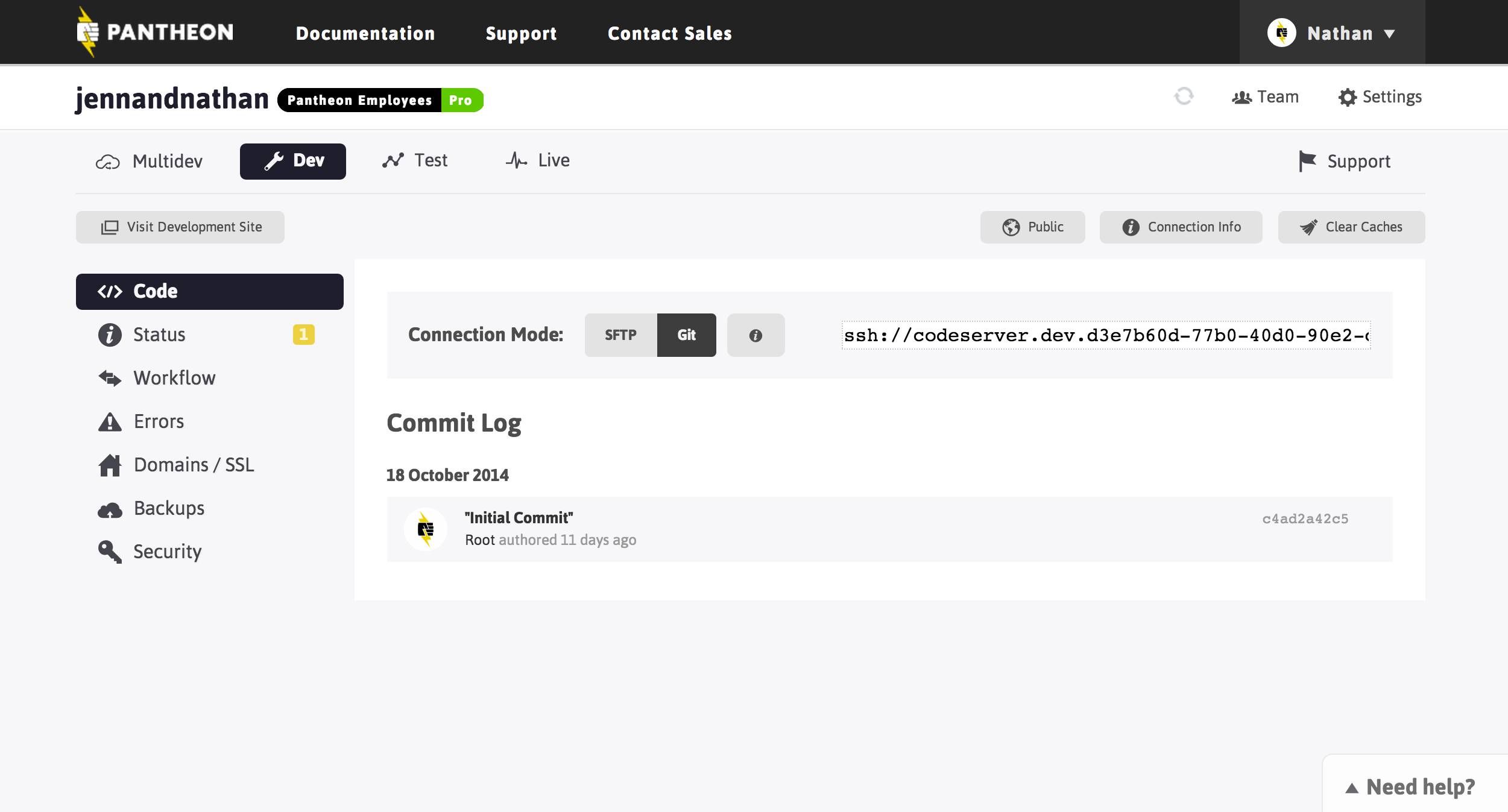
2. Creating a guided experience to installing a site's CMS
After creating their first Pantheon site, users are taken to the new site's dashboard. This dashboard was one of the most confusing areas for new users, who were unsure of what action they should take next and unaware that they should install the site's CMS (WordPress or Drupal) first. We created an empty state for this first dashboard screen to prompt the user to install their site's CMS.
The site dashboard now has an empty state prompting users to install their CMS
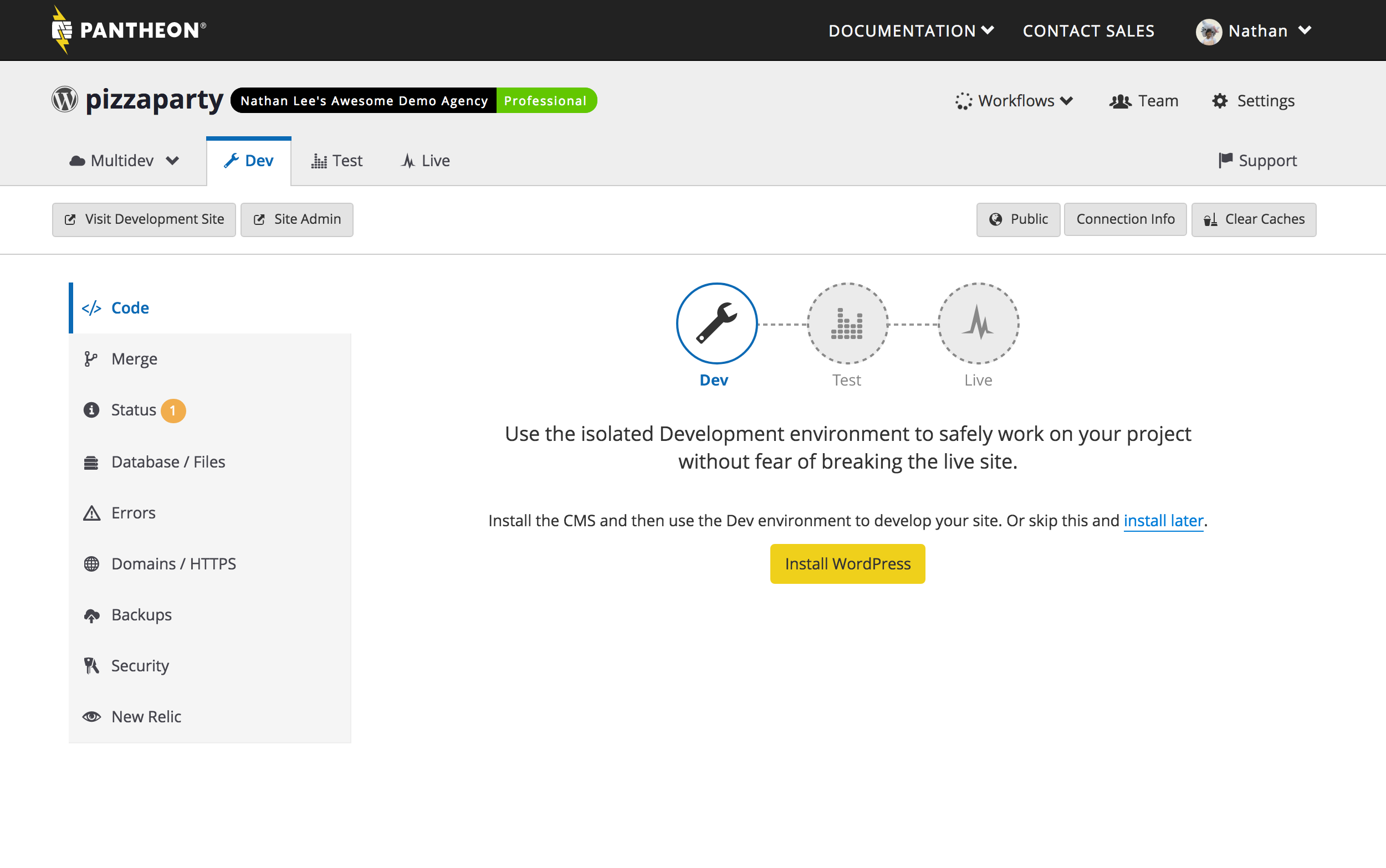
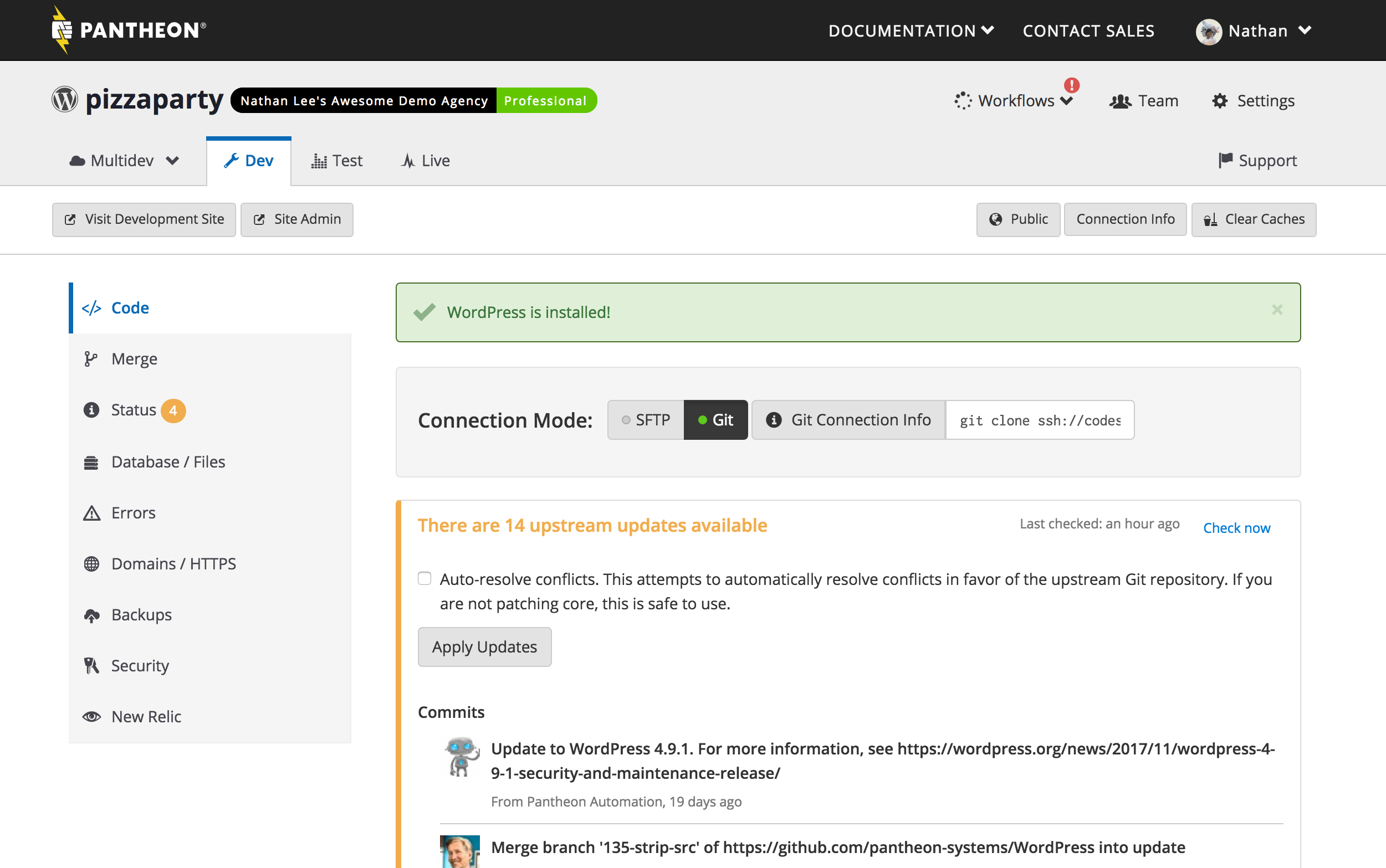
One challenge designing for Pantheon is having to design with multiple browser windows or tabs. Developers will open a tab with the site they're building and another tab with the Pantheon dashboard to manage the site code. To deal with this, we check for the CMS installion on the dashboard once the user clicked to "Install Site CMS" – once the CMS is detected (we provide a safety net so the user can always manually recheck) the empty state is replaced with a success message and our code development dashboard module.
The dashboard displaying success and the push code module
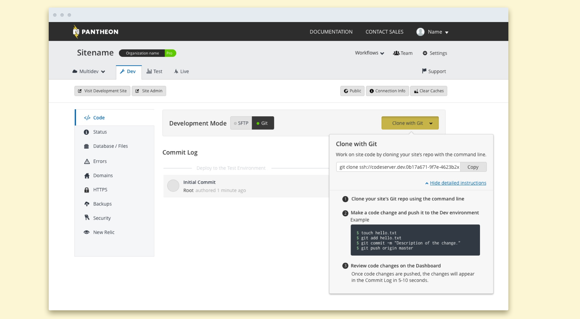
3. Improving how site code is developed
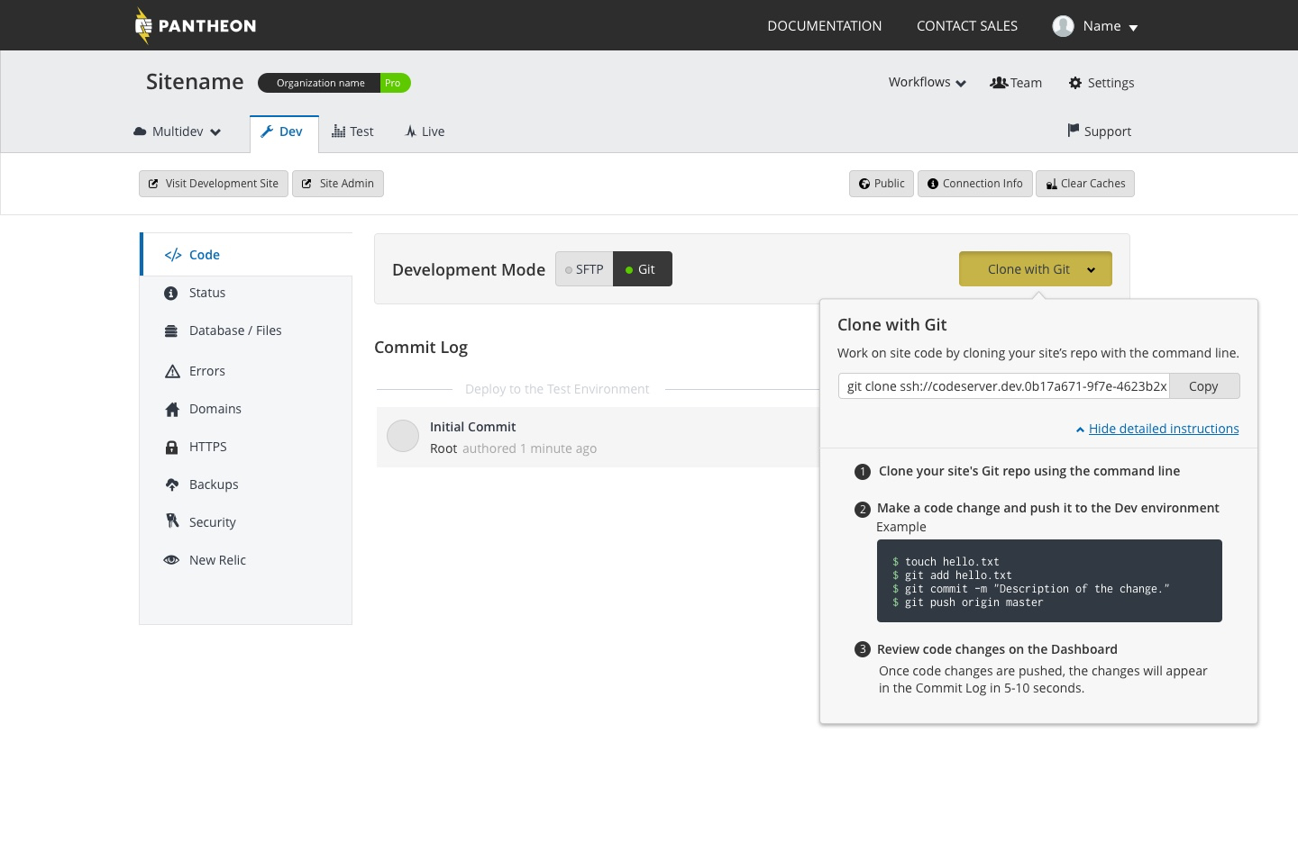
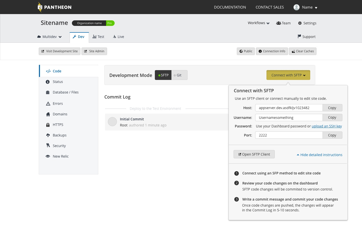
The final portion of the (new) new user experience was developing site code and pushing those changes to their site environment. During our product participant observations we noticed that the information for developing using SFTP/Git was too long for one screen, and had no order or hierarchy which made it confusing when to use what information. I redesigned the information to give the user: direct and more distinct calls to action, information they needed to immediately change their code, and more skimmable instructions on how to developing site code.
More concise and copy-pastable Git coding instructions
Improved SFTP code instructions
Conclusion
This project was one of the most comprehensively designed at Pantheon – design touched every part of the process from: exploratory/generative research, creating hypotheses and prototypes, designing new product experiences, and managing the implementation in stages. Despite not being on the roadmap, the management team at Pantheon trusted the product and design team to use their expertise to create product changes that would drive key performance indicators that contributed to the company goals.
I am proud of the results, we have created a comprehensive first time user experience that has surfaced user needs and married them to business value. From just the third stage alone, we have increased code pushes from first time users by 10%. I am excited to utilize the learnings and process from this project to inform future work on how to create product change with real customer and business value.