Design at Pantheon
Pantheon is a website management platform for Drupal and WordPress that provides developers, schools, and agencies with container based hosting and powerful developer tools.
Integrating Design into Culture
When I first started at Pantheon, I was originally reporting to the engineering organization. The company was enthusiastic about hiring its first and only product designer but was not sure how to best put my skills to use. Luckily for me, Pantheon was always open to embracing the benefits of design contributing to its culture and process. Over time, I have worked to solidify my design process and contributed toward a number of initiatives:
- Design helping at all stages
Design started out downstream in the process and would often run into limitations or issues from being pigeon-holed to solving aesthetic issues instead of fixing product problems. I shared the benefits of a more disciplined user centered design approach and how it could benefit projects from an early stage with teams. Over time I incorporated usability testing, user interviews, surveys, prototyping, and competitive research to help the organization better define product requirements, forecast problems in the product, and create product solutions that better aligned with user needs.
- Establishing a design vision
Throughout my time I worked with product managers, the head of product, and meeting with our CEO to discuss design's work/influence and adjust its goals/contributions to align with the company strategy and KPIs. I regularly presented research and design work on Thursday "super scrum" show and tells, gave talks about design tools and processes, and presented feature work in monthly meetings with the leadership team. Design has become a well oiled machine complete with playbooks that catalogue and define design's processes for others to understand and utilize.
- Making a case for a seat at the table
Over time my accomplishments and ability to execute bought enough credibility and enthusiasm around design work that we knew that the organization needed to make significant investments in design at Pantheon. I advocated for increasing our design headcount and helped hire a marketing designer, front end engineer, and product designer. Over time in order to better align design with its value and contributions, the product designers were moved from engineering to product, showing Pantheon's commitment to design having a place and a say in creating impactful decisions for its end users. My hope is that my work will continue to drive demand for more design resources and that eventually design at Patheon will become its own department in Pantheon.
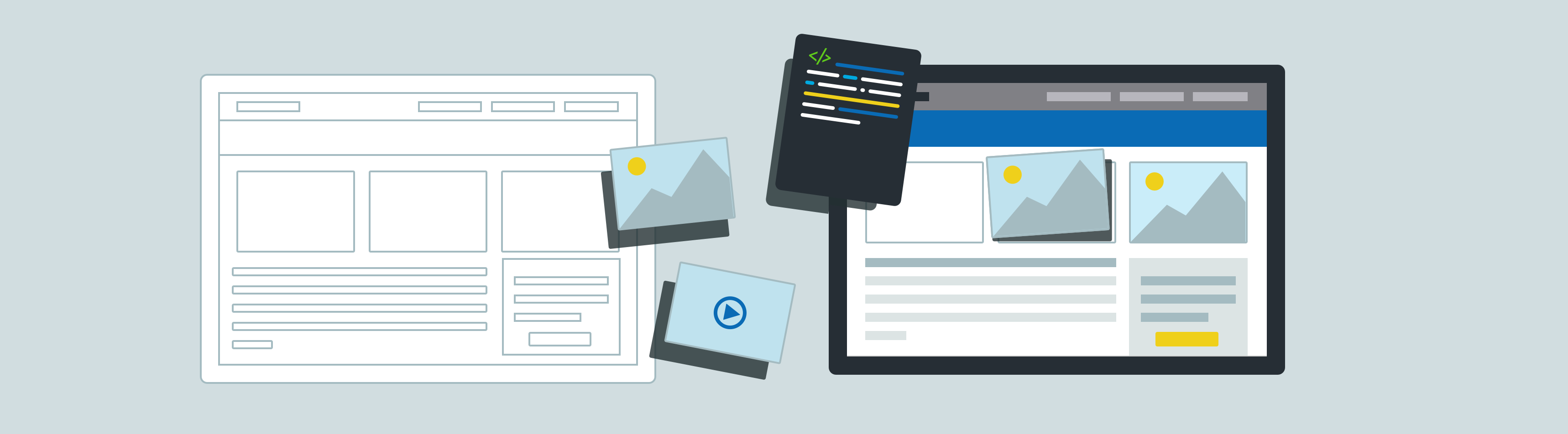
Creating the Pantheon Front-End Design System
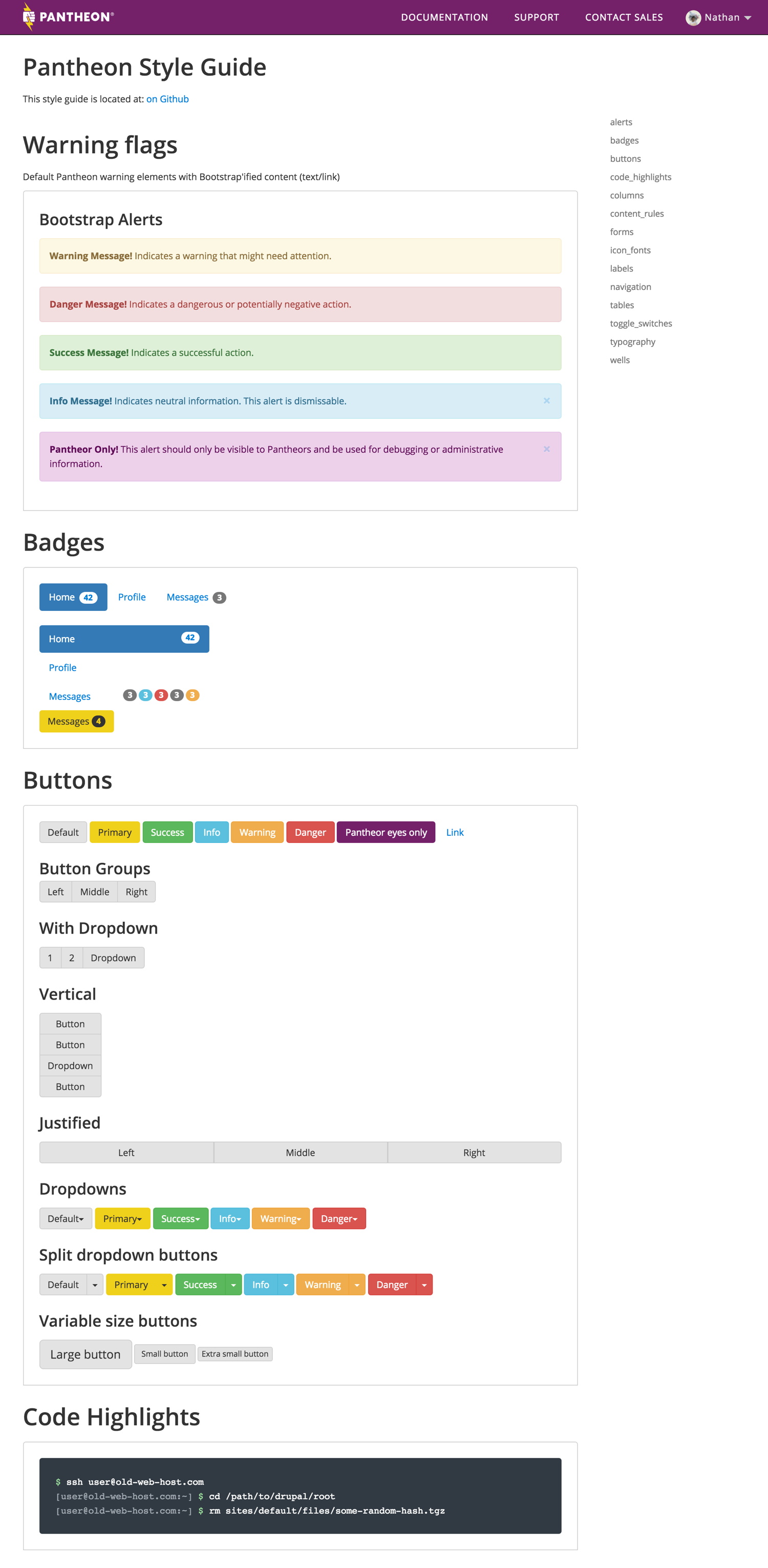
As the product designer at Pantheon I worked with the engineering team to create product features and interactions. However the dashboard was in a tough place, it lacked structure in its codebase, the interface misused several interaction, and had several usability issues. The result was a product that was hard to learn as a user, and hard to build for as an engineer or designer. I took it upon myself (since there were no dedicated front end engineers at the time) to refactor our dashboard code and , and create visual design patterns to create a more scalable system.
Legacy dashboard
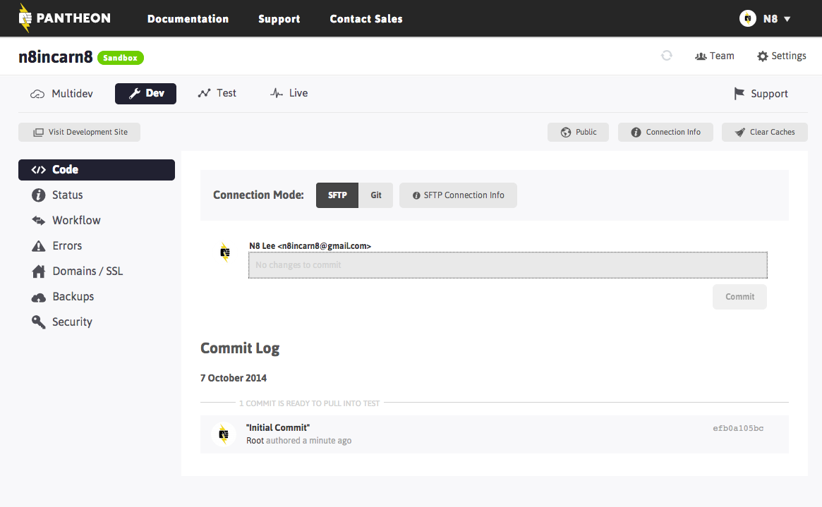
- 6 levels of navigation/toolbars
- Navigation nearly indistiguishable from buttons
- Misused a number of UX conventions: Primary CTAs are red
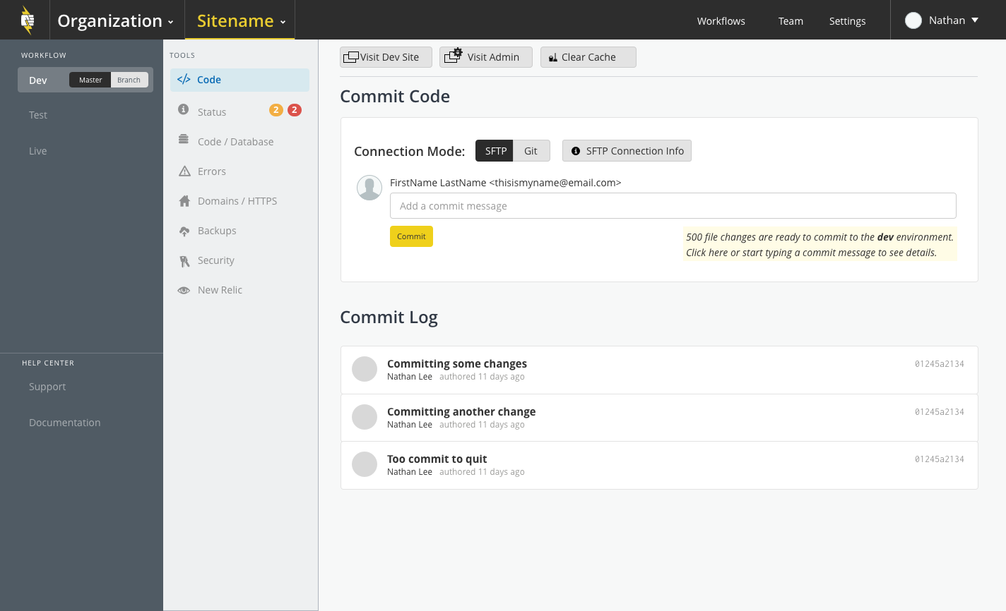
Current dashboard
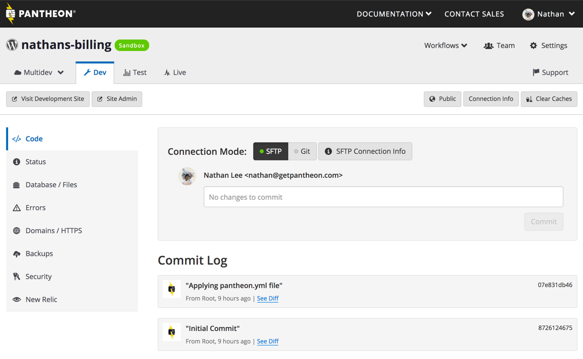
- Standardized on Bootstrap
- Cleaned up UI patterns
- (Beginning to) reduce number of redundant buttons and layers of navigation
- Removed over 3000 lines of redundant/deprecated CSS
- Implemented styleguide v0.1
Starting the Design System
Our codebase was a mish mash of a legacy DIY front end code from several different developers. Over the course of several months I worked in multiple sprints to refactor and convert the codebase and standardize it on a framework. After the first 2-week sprint I was able to reduce the CSS ruleset size by almost 50%, eliminating over 600 declarations and removing around 3000 lines of code. The new front end implementation is modern, modular, and would speed up onboarding new front engineers. In addition, the new front end code could easily approach would unify the designs with what would be implemented in code.
Still a work in progress...
There's still a lot of work to be done on the dashboard to fully componentize the code and create a "living" design and code system. The hope is to create a dynamically created component library that can be fed data and render a fully realized design/interface pattern for use in both production or documentation/styleguide. By creating a more scalable/manageable design system we can codify our design/interaction decisions and create a developer tool that is intuitive and powerful.
Re-imagining the dashboard
Over time I've had thoughts on how we could reduce complexity on the dashboard and create stronger foundations so that adding new features is simple and orderly. During some of my spare time at Pantheon I've created design explorations reimagining our dashboard, I like to think of this as a continual thought exercise until the day that we decide to rebuild the dashboard to make v2.0.
Fun with design
In addition to my product roles I worked on visual and branding projects for Pantheon. On April Fools 2015, I created some screens and graphics for an Easter Egg on the dashboard – an "asteroids" styled game where the user could shoot "destroy" elements on their dashboard to score points.
Expanding on brand design
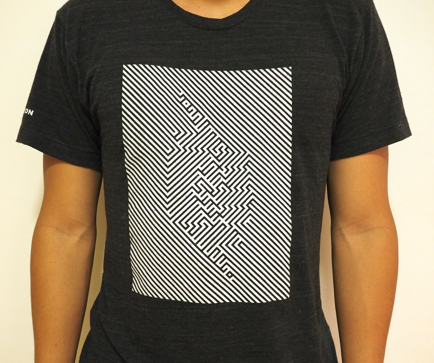
I also had the opportunity to create some marketing swag for our biggest conference of the year, Drupalcon. My t-shirt print was based off "razzle dazzle" camouflauge used on World War I War ships.