Do.com
Do.com was a Salesforce company that wanted to elevate its productivity app beyond just to-do lists and due dates. I worked as a product designer working on their revamping their onboarding flow, redesigning their new iOS 7 app with the design team, and various marketing projects including redesigning and coding a new home page to promote a new marketing video.
As a designer on the team I worked to create product wireframes for our new iOS 7 app, conductive user research to inform our app redesign, , designed, and coded our marketing website.
Designing a new iOS 7 app
When iOS 7 was announced, the Do team was excited to redesign their mobile app from the ground up with an updated interfaces and new phone functionality. Our goal was to rethink how our app was used on phones and to create a social and collaborative platform for getting things done.
We conducted user interviews about productivity and managing multiple life contexts (your work life, your home life, or your social life). I redesigned the app from the ground up in hopes of making a smarter to-do list that was optimized for one handed on-the-go task management. I wanted to create smarter features that would help you share, prioritize, and accomplish your to-dos.
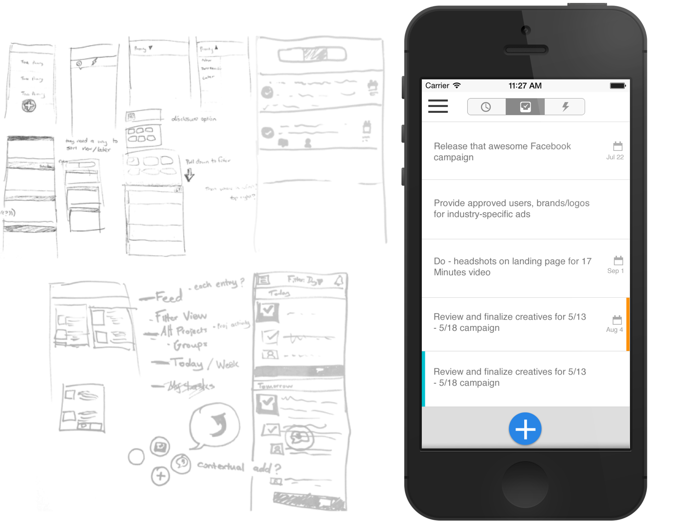
A smart task list
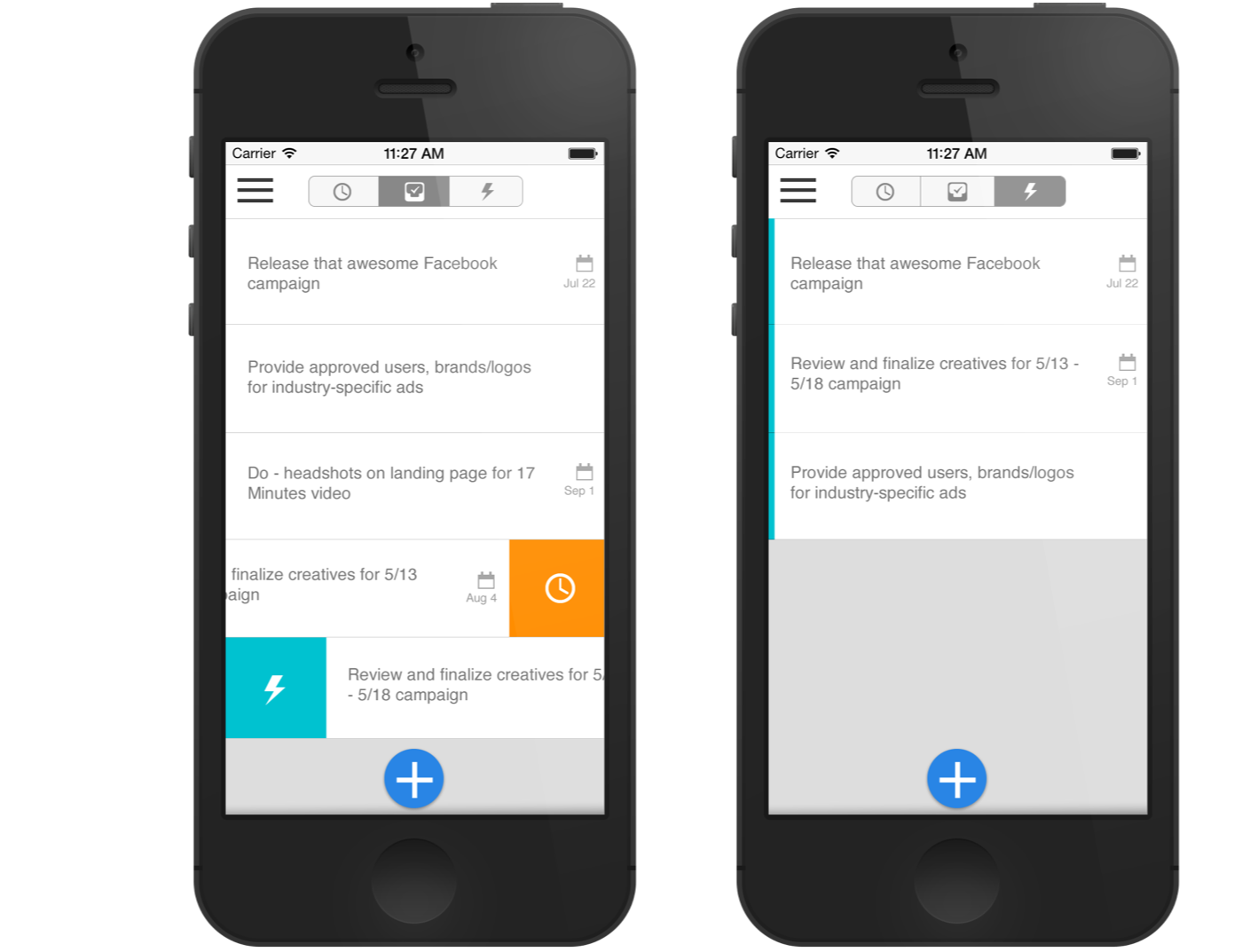
According to our user interviews, a task list can become daunting and less useful when a user and their collaborators overload it with to-do's. In order to help a user prioritize and better manage their tasks, I designed an interface where users manage tasks by swiping left to right to send it to a priority box or right to left in order to triage tasks to be completed later.
My favorite part of the design was thinking of how to intelligently help a user get work done. I envisioned the app would use the time of day, applied #tags or categories, and location to help recognize when a task should be prioritized. If an engineer completes #backend #bugs between 10AM and 6PM at 123 Work St., the app could surface #backend #bugs to the user whenever they arrive at their desk during the work week.
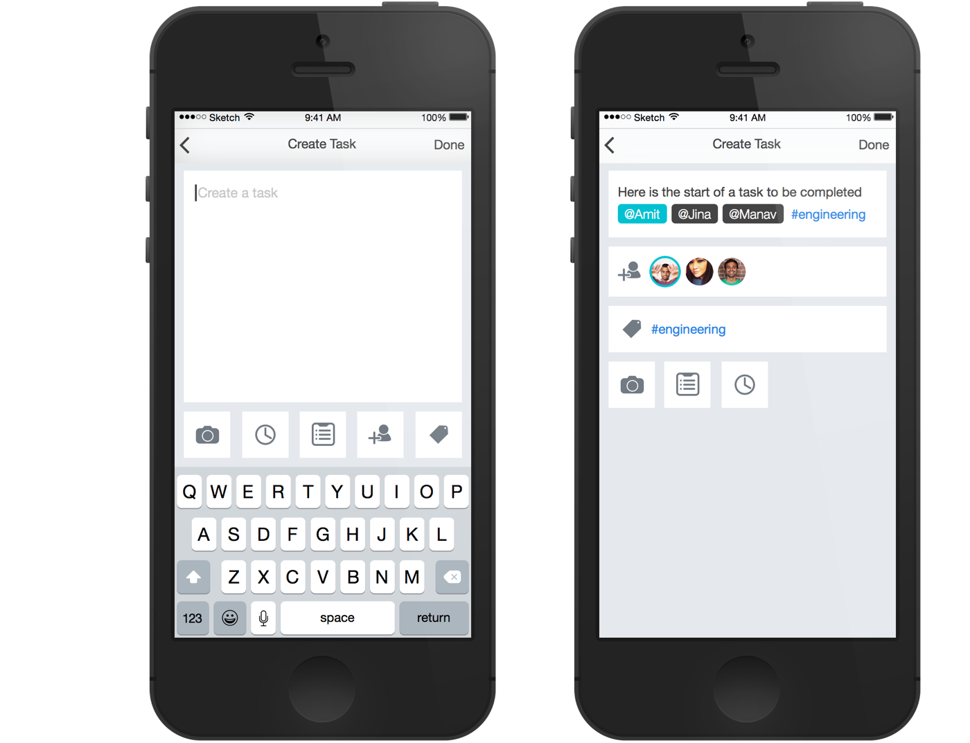
Lightweight task creation
When redesigning the new Do app I thought about quick ways to pack a lot of information into a single input. I thought of using natural language and text like Twitter to engage users with @mentions and categorize information with #hashtags. My design used less taps and scrolling to assign important information to tasks and made them look more like a conversation. By using text and natural language processing to parse important due dates, collaborators, or categories the user could have a more intuitive experience and be quicker at task creation and comprehension.
Designing the new Do.com
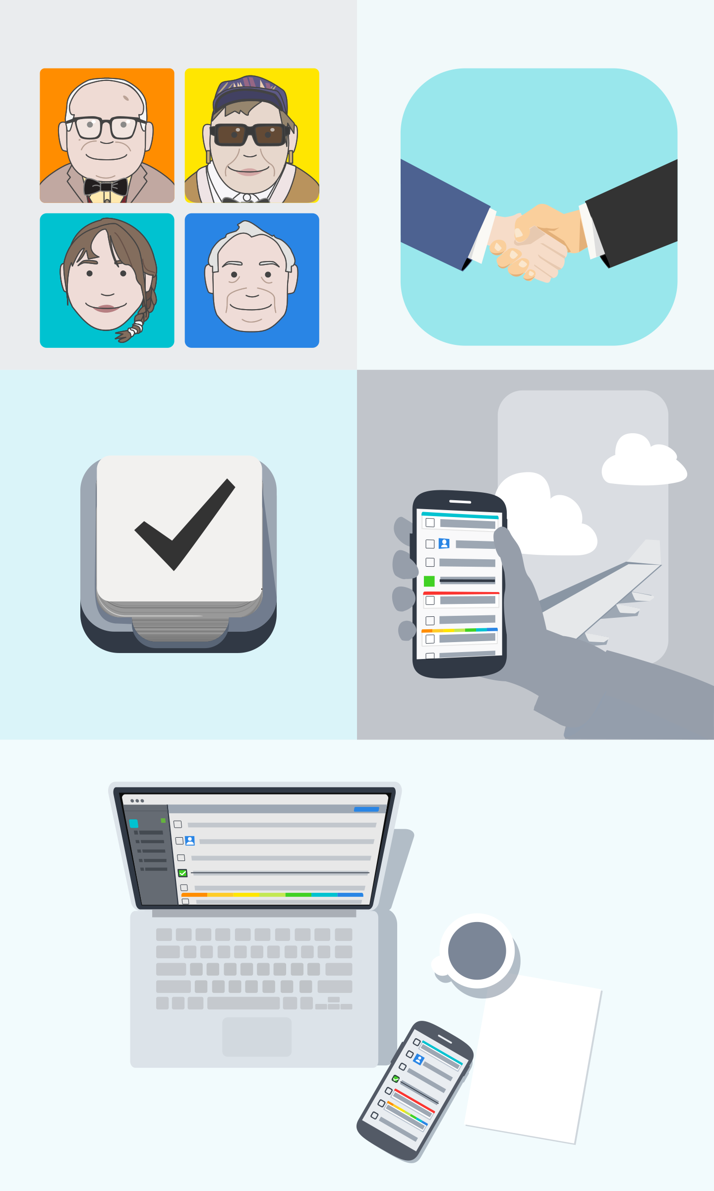
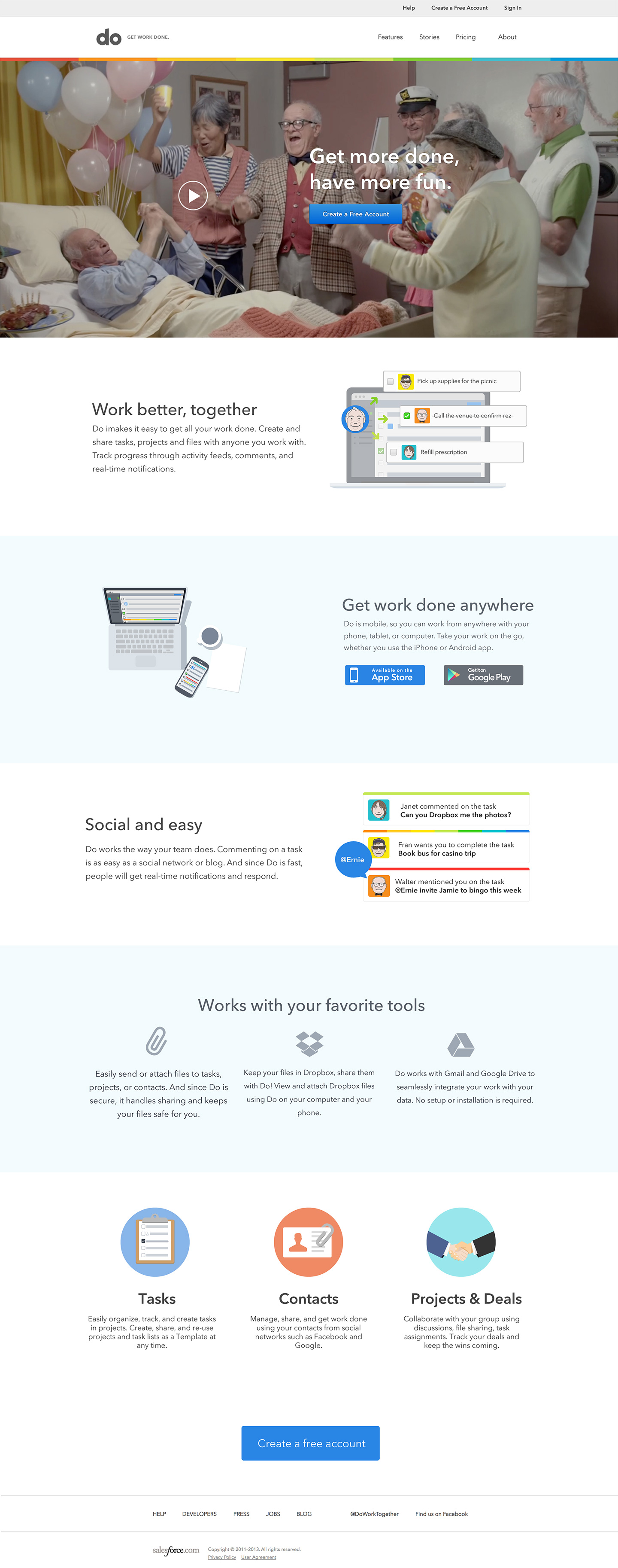
In addition to my product design responsibilites I also created marketing collateral for social media, banner ads, marketing video interfaces, and redesigned Do.com's website. I created the new web site with a rebrand that included a revised color palette, simpler logo treatments, illustrations, and a new front end codebase. Our new home page to promoted the story of Do.com and our new product video.